Matplotlib—Making data visualization interesting
Table of Contents
Data visualization is a key step to understand the dataset and draw inferences from it. While one can always closely inspect the data row by row, cell by cell, it’s often a tedious task and does not highlight the big picture. Visuals on the other hand, define data in a form that is easy to understand with just a glance and keeps the audience engaged.
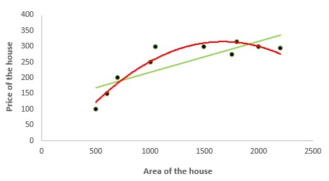
Matplotlib is a basic library that provides options for various plots along with extensive customizations in the form of labels, title, font size etc. I watched numerous videos and read articles online for visualization. To understand Matplotlib better, I took the population density dataset from Kaggle and started creating my own visualizations.
This article highlights the plots I drew, including the customizations and inferences that I drew from the data. The complete work is present as a GitHub repository as Visualization using Matplotlib for quick reference. Let’s begin!
Source: towardsdatascience.com