Visualizing Traffic Safety with Uber Movement Data and Kepler.gl
Table of Contents
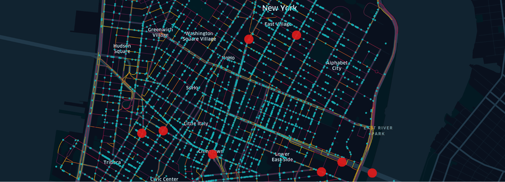
Learn how to use Kepler.gl for data visualization through our tutorial, where we show how easy it is to load multiple datasets into Kepler.gl to visualize traffic safety in Manhattan. Urban traffic can be dangerous, a point known all too well by city dwellers and drivers. Discovering the most dangerous street locations in a city can help urban planners take steps to enhance safety through strategies such as lower speed limits or traffic rerouting.
To demonstrate this power of data visualization, we offer a use case showing the most dangerous traffic locations in Manhattan. For this visualization, we leverage Kepler.gl, an open source data agnostic web-based application capable of exploring large-scale geolocation datasets, along with three datasets containing traffic information. These datasets come from public and private sources, and offer different data-driven takes on traffic safety.
The ability to derive useful insights from data visualization often comes from the ability to combine different data related to the same topic. Our use case will show how Kepler.gl makes it very easy to build a visualization from disparate datasets. For this example, we have collected three data files containing street speed data, vehicle road crash data, and fatal crash data.
The street speed data comes from Uber Movement, a program where we offer aggregated, anonymous data gathered from Uber’s many driver-partners about traffic movement to local governments so they can improve their traffic planning. This dataset, which is not publicly available, gives us traffic speeds in different parts of cities over different times. The vehicle road crash data and fatal crash data are both publicly available from the National Highway Traffic Safety Administration (NHTSA) and the New York City Police Department (NYPD).
Source: uber.com